本章记录本博客对于 Shoka 主题的美化魔改之加载动画修改
# 加载动画
# 概要
shoka 主题自带的旋转猫🐱,感觉不好看,所以我们换一个加载动画
# 加载动画修改步骤
# 修改 NJK
- 打开主题根目录:
themes\shoka\layout\_partials\ - 打开
layout.njk文件 - 页面查找
Ctrl+F找loading,动画部分是 <div id=loading>
<div id="loading"> | |
//这个div就是我的动画,原来的是class="cat",我的是col-sm-2 | |
<div class="col-sm-2"> | |
<div id="wave1"> | |
</div> | |
</div> | |
</div> |

# 修改 stylus
- 找到
themes\shoka\source\css\_common\components\third-party\loading.styl - 修改 loading 中的 css
- 找不到就页面查找
Ctrl+F找loading
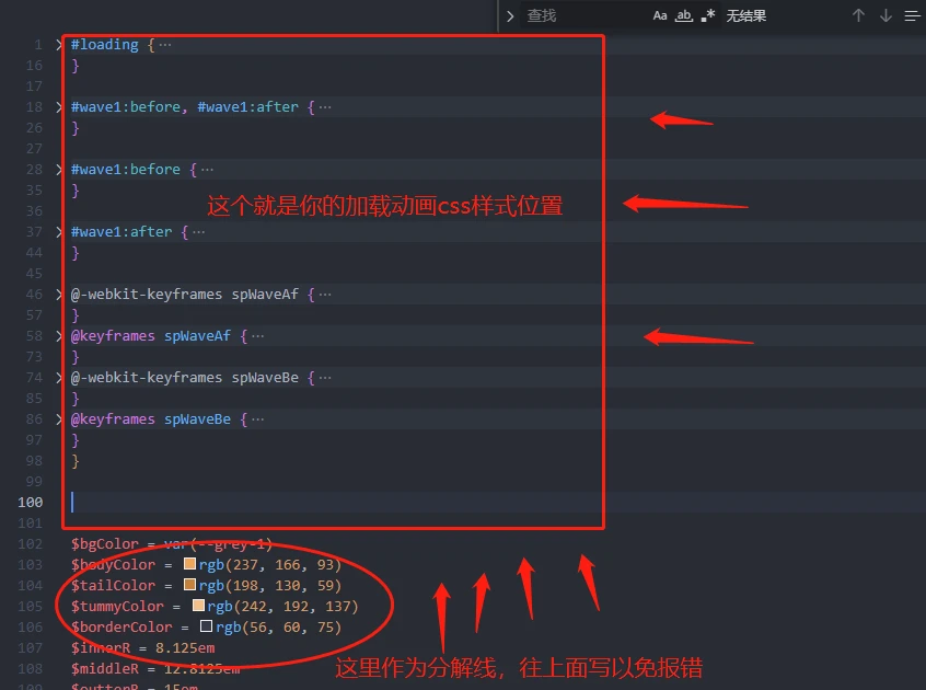
#loading { | |
@extend $fix-fullscreen; | |
background-color: var(--grey-1); | |
if(!hexo-config('loader.start')) { | |
display: none; | |
} | |
//这是我的样式参考,当然了你可以根据你自己的来修改 | |
#wave1 { | |
display: block; | |
position: absolute; | |
top: 50%; | |
left: 50%; | |
height: 50px; | |
width: 50px; | |
margin: -25px 0 0 -25px; | |
border-radius: 50%; | |
} | |
#wave1:before, #wave1:after { | |
content: ''; | |
border: 2px solid #008744; | |
border-radius: 50%; | |
width: 50px; | |
height: 50px; | |
position: absolute; | |
left: 0px; | |
} | |
#wave1:before { | |
-webkit-transform: scale(1, 1); | |
-ms-transform: scale(1, 1); | |
transform: scale(1, 1); | |
opacity: 1; | |
-webkit-animation: spWaveBe 0.6s infinite linear; | |
animation: spWaveBe 0.6s infinite linear; | |
} | |
#wave1:after { | |
-webkit-transform: scale(0, 0); | |
-ms-transform: scale(0, 0); | |
transform: scale(0, 0); | |
opacity: 0; | |
-webkit-animation: spWaveAf 0.6s infinite linear; | |
animation: spWaveAf 0.6s infinite linear; | |
} | |
@-webkit-keyframes spWaveAf { | |
from { | |
-webkit-transform: scale(0.5, 0.5); | |
transform: scale(0.5, 0.5); | |
opacity: 0; | |
} | |
to { | |
-webkit-transform: scale(1, 1); | |
transform: scale(1, 1); | |
opacity: 1; | |
} | |
} | |
@keyframes spWaveAf { | |
from { | |
-webkit-transform: scale(0.5, 0.5); | |
transform: scale(0.5, 0.5); | |
-webkit-transform: scale(0.5, 0.5); | |
transform: scale(0.5, 0.5); | |
opacity: 0; | |
} | |
to { | |
-webkit-transform: scale(1, 1); | |
transform: scale(1, 1); | |
-webkit-transform: scale(1, 1); | |
transform: scale(1, 1); | |
opacity: 1; | |
} | |
} | |
@-webkit-keyframes spWaveBe { | |
from { | |
-webkit-transform: scale(1, 1); | |
transform: scale(1, 1); | |
opacity: 1; | |
} | |
to { | |
-webkit-transform: scale(1.5, 1.5); | |
transform: scale(1.5, 1.5); | |
opacity: 0; | |
} | |
} | |
@keyframes spWaveBe { | |
from { | |
-webkit-transform: scale(1, 1); | |
transform: scale(1, 1); | |
opacity: 1; | |
} | |
to { | |
-webkit-transform: scale(1.5, 1.5); | |
transform: scale(1.5, 1.5); | |
opacity: 0; | |
} | |
} | |
} |
# 偏移修复
- 打开
themes\shoka\source\css\_common\outline\outline.styl - 页面查找
Ctrl+F找.cat - 按照.cat 的写法在下面加上你的,比如我的是
.col-sm-2, 所以写成下面这样
.cat { | |
margin-top: 10rem; | |
margin-top: 20rem; | |
} | |
//这是我的,因为我的class就是col-sm-2 | |
.col-sm-2 { | |
margin-top: 20rem; | |
margin-left: 15rem; | |
} |
# END
✔️大功告成,如果你配置有问题可以评论,我会帮助你